In case you missed it, the Astros recently (inadvertently) leaked new uniforms that look a hell of a lot like their old uniforms. This follows a recent trend of permanent throwbacking employed by the Orioles and Blue Jays. But ideally it won’t stop there. Old is the new new, and several other teams could benefit from incorporating aspects of old uniforms — if not in merchandise sales, then in the all-important department of my personal opinion.
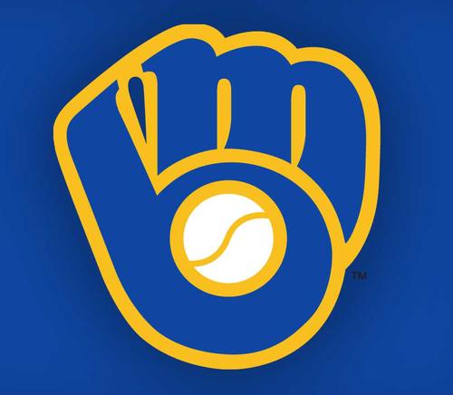
Milwaukee Brewers: There’s nothing particularly off-putting about the Brewers regular uniforms. But the Brewers have in their recent history the single most clever logo in the history of baseball. It’s a GLOVE MADE FROM THEIR INITIALS! How do you ever, ever abandon that? I know they still wear this sometimes, but it’s a travesty that it’s not an everyday thing:

Los Angeles Angels: This one’s probably too big a pain in New Era’s ass for it to actually happen, but in the 1960s the Angels actually wore a hat with a silver halo on it. It’s a divisive design, I realize, and it actually kind of looks like the hat itself is wearing a yarmulke. But it seems way past time teams start incorporating hat elements beyond the front panels, and this one’s too clever to eschew:

Pittsburgh Pirates: OK, this one’s definitely not happening. And I like the Pirates’ current look. Plus there’s nothing about the stovepipe hat that has anything to do with actual pirates, and if the Pirates were actually committed to wearing a non-traditionally shaped hat I might suggest they go full bore with it. But it does seem like a good idea to distinguish the Pirates from the rest of the Majors somehow, and what better way than by having them wear an incredibly silly hat? I actually own one of these and used to wear it with the fake mustache at shows with my band until my then-girlfriend-now-wife told me it creeped her out:

San Diego Padres: This is the most important one, by far. And it was the sight of the Padres playing in a Mets Classic from 1986 on SNY here in the office that prompted this post. Who the hell let the Padres go blue? If I worked at Major League Baseball’s Office for Standards and Decency — which definitely exists — and some team called me up to say they were thinking of changing their uniforms, I’d say, “That’s cool, but no blue.” Every team is blue! I just counted: 20 of the 30 teams have blue in their uniforms. More than half of baseball teams feature some shade of blue as their dominant color. The Padres have some butt-ugly looks in their past, no doubt, but there was nothing wrong with the handsome autumnal color scheme that they ditched in the early 90s. Look at what a boring hat this is. Now compare its bland navy blue to the robust tones of the one modeled by Garry Templeton below:


Hey there! This is my first comment here so I
just wanted to give a quick shout out and tell you
I truly enjoy reading your posts. Can you suggest any other blogs/websites/forums that deal with the same subjects?
Thanks a lot!